Electric vehicles and power consumption at home – an analysis of charging patterns in Norway in 2020
At Elvia, we believe that data and data-driven decision making is the way forward. As data scientist, we have an important role in this process, helping the analysis of available data to generate new insights. In this blog post, by using data gathered through smart meters, we provide key visualisations to understand what it means to charge an electric vehicle (EV) at home in 2020: weekly patterns, comparison with household without EV, etc… The explosion of electric vehicles in Norway has modified how energy is used at home, and here we show the real changes in consumption patterns in 2020. In fine, understanding better these new charging patterns is key in order to operate and maintain the electric grid of today and plan the grid of tomorrow.
Dataset
As part of Elvia’s large pilot study on power tariff, a survey was conducted to understand the pilot end user relationship with using and saving energy. Two questions of this survey targeted electric vehicles (EV):
- we asked the end users if they owned an EV vehicle in 2020
- if they did, we asked if their household was the main charging point for their car.
The dataset gathered for this analysis is as follows:
- the hourly consumption (active energy, kWh/h) for 2020 of 181 end users that own and charge their EV at home (EV group), who answered yes to both questions above
- the hourly consumption for 2020 of 978 end users that do not own an EV (no-EV group), who answered no to both questions above
- the type of household these end users live in, with four categories possible: detached house (enebolig), semi-detached house (tomannsbolig), townhouse (rekkehus) and apartment (leilighet).
We filtered the hourly consumption to keep only households where we had 99% of all hourly consumption data points available for 2020 (8696 out of 8784).
Visualising hourly consumption in 2020
The raw data for a randomly picked end user from the no-EV group (top) and a randomly picked end user from the EV group (bottom) can be observed in Figure 1.
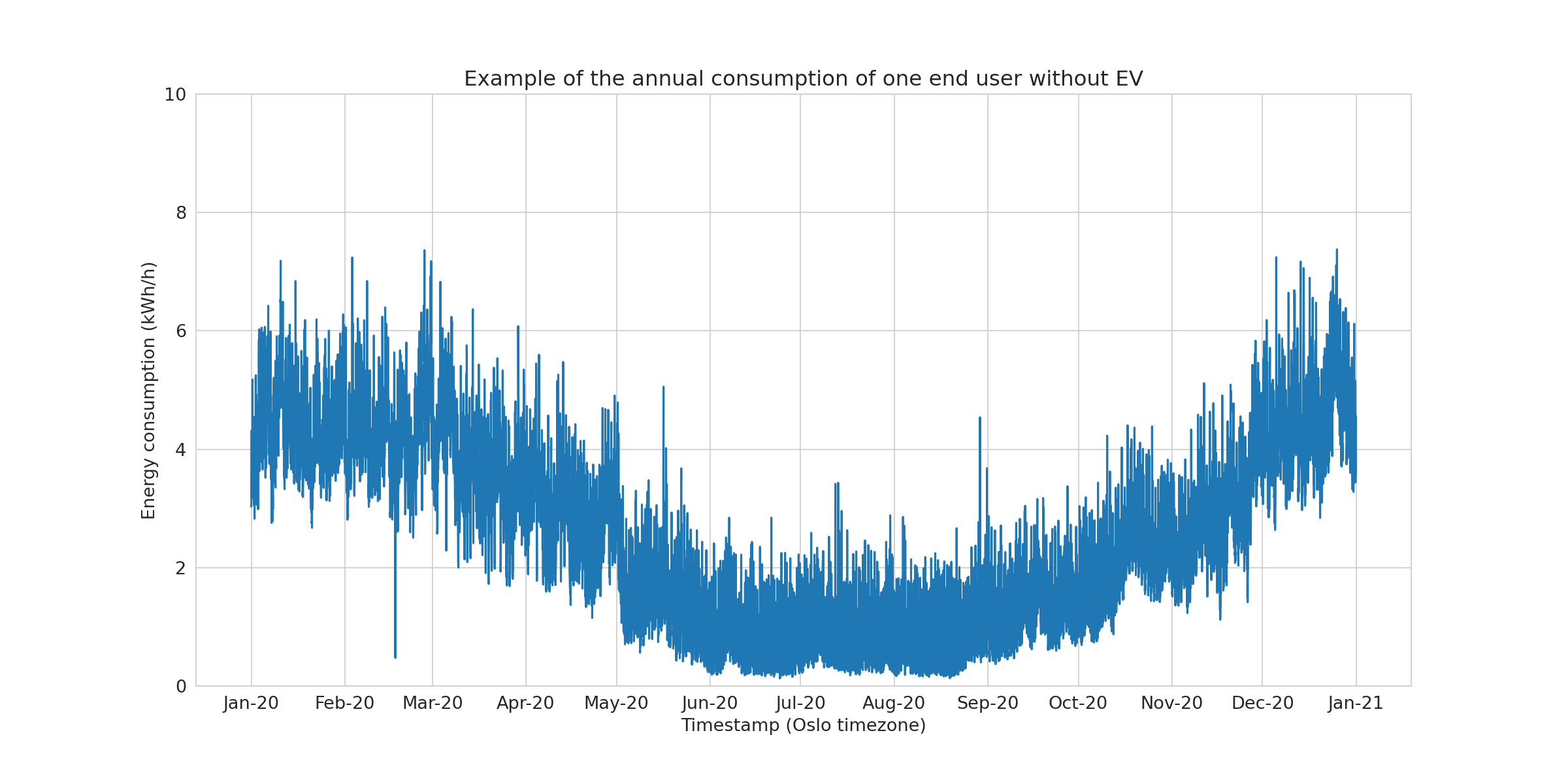
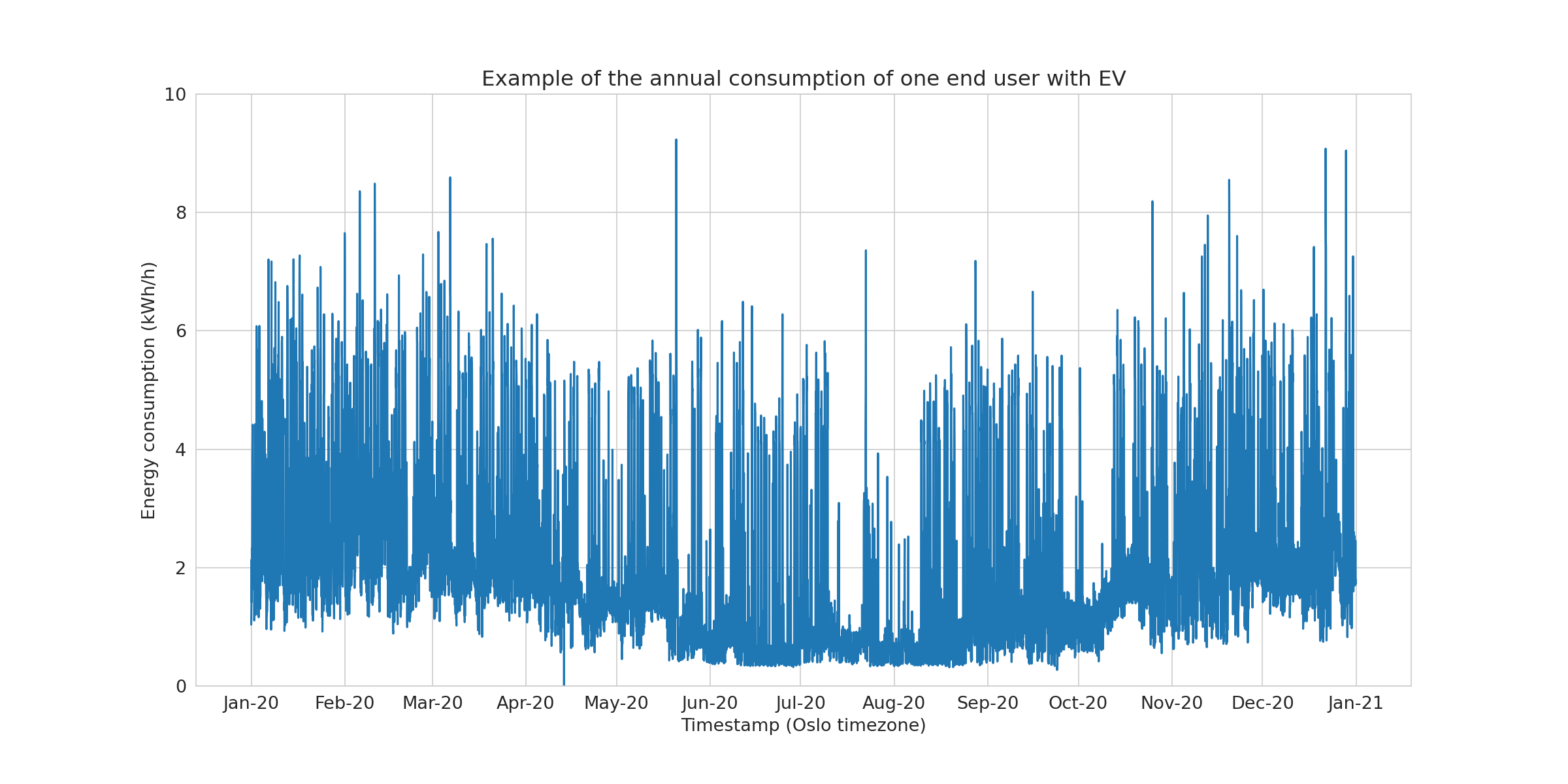
The usual yearly variation observed in Norwegian households is seen in both examples. Hour-to-hour variability due to daily changes in electricity consumption is also observed. In the next paragraph, we look at the level of electricity consumption between the groups the two groups.
Extracting min, average and max per day
To compare levels between groups, each hourly consumption was summarized into a daily consumption, leading to reduction of the time series length from 8794 points to 366 points. Three series per end user were obtained (Figure 2) as the average per day (daily_avg), min per day (min_day) and max per day (max_day) were used to summarize the daily consumption.
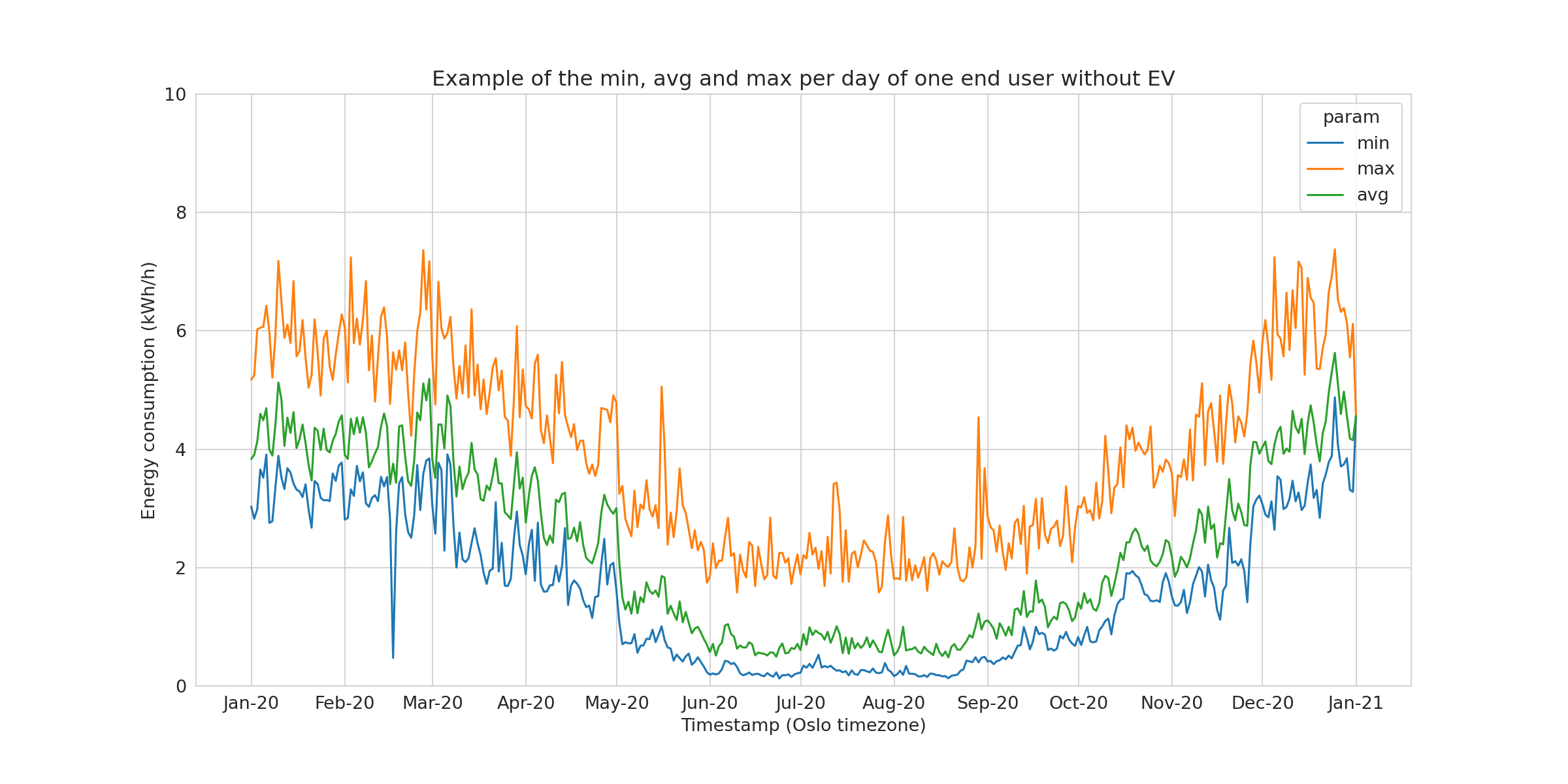

When all the members of the group are transformed, one can represent the mean maximum, mean minimum and mean average and the respective confidence interval of each mean, represented here using the standard error of the mean.
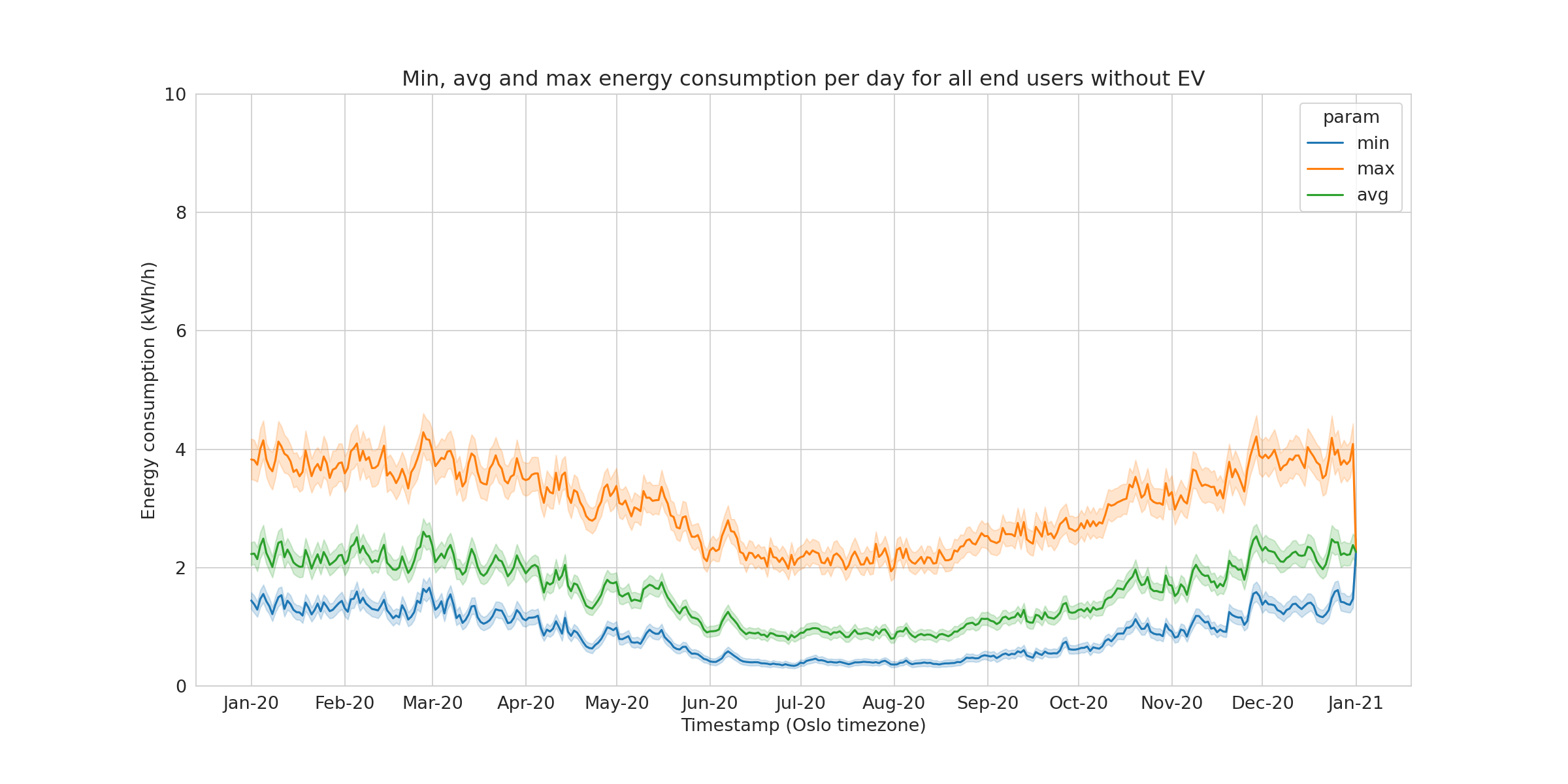
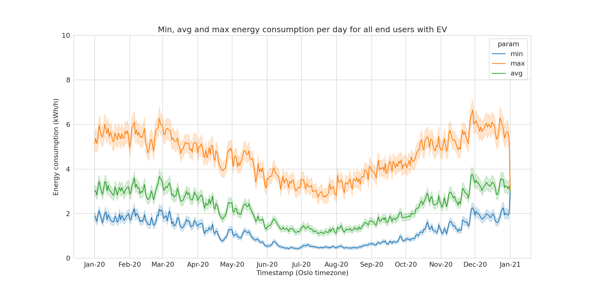
We clearly see that both the mean daily average and even more the mean daily maximum are higher in the EV group. We believe that two main factors explain these differences:
- larger households in the sample of the EV owners
- the charging of EV In the next paragraph, we will show more in details which effect these two factors have.
Weekly patterns analysis
In this paragraph, we will look at the hourly-based weekly average (HOBWA) patterns. This representation of the data allows to an easy analysis of weekly patterns.
Generating HOBWA curves
The HOBWA curves are generated as follows. For each end user:
- Start the hourly consumption for the whole dataset
- For each timestamp, generate a variable containing the hour of the week. The hour of the week is between 0 and 167.
df['hour_of_week'] = df['date'].dt.dayofweek * 24 + (df['date'].dt.hour) - For each hour of the week, measure the average consumption At the end, you have a reduced the dimensionality from 8794 points to 168 points.
Then, for each group (EV and no-EV group), the group mean is calculated: \[ HOBWA_{EV} = \frac{1}{N_{EV}}\sum_{i=1}^{N_{EV}}{HOBWA_i} \] \[ HOBWA_{noEV} = \frac{1}{N_{noEV}}\sum_{i=1}^{N_{noEV}}{HOBWA_i} \]
Finally, to see the variations of the weekly pattern independently of the level of the curves, we also look at centred HOBWA curves: \[ HOBWA_{EV,cent} = HOBWA_{EV}-\mu_{HOBWA_{EV}} \]
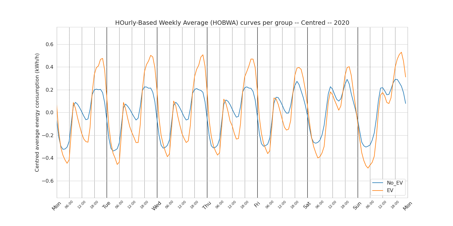
EV vs. no-EV : all the data
In Figure 4. we can see the weekly patterns for the EV and no-EV group. The bottom figure shows the centred curves for easier visualisation of the differences between the curves that are not difference in level.
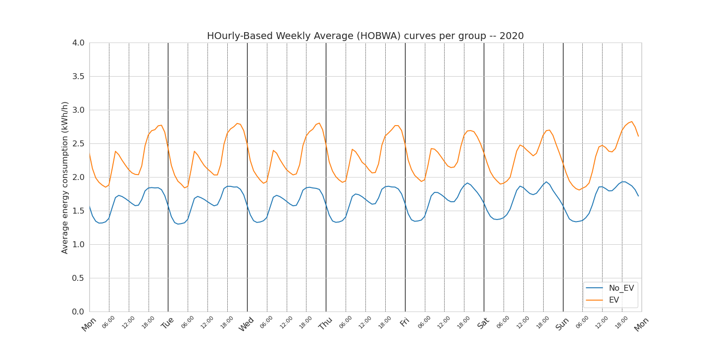
There is a lot of information to unpack here. We see again, as in the previous chapter, that the average consumption is higher for the EV than no-EV group. From the figure showing the centred weekly patterns, we can extract the following observations:
- the morning peak is not more important in the EV group (respectively to their mean) that the no-EV group
- the afternoon peak is much larger in the EV group than the no-EV group. The amplitude of the difference is not relevant (as we have taken the mean of the mean of the mean!). More interestingly, this afternoon peak starts to be larger around 18:00 every day and “finishes” around 03:00 the day after
- the level of the afternoon peak is constant from Monday to Thursday. For the EV group, the afternoon peak is lower on the Friday and Saturday. For the no-EV group, the afternoon peak is higher on Friday and Saturday. Possible explanations (not able to check in this analysis) is that EV owners do not charge their EVs as much on Fridays and Saturdays.
- the afternoon peak is maximum around 21:00 / 22:00 for the EV group and around 18:00 / 19:00 for no-EV group. This can be interpreted as a possible first sign of smart charging patterns of a subset of the EV owners.
- the consumption between 03:00 and the morning and the consumption the morning peak and the afternoon peak is more flat for the no-EV group than the EV group which we believe to be dependant of the type of household.
Based on this observation, we were interested to look at two factors that are usually affecting the level of consumption: season and type of housing. What we try to do here is to understand if these factors have an influence on the pattern of consumption.
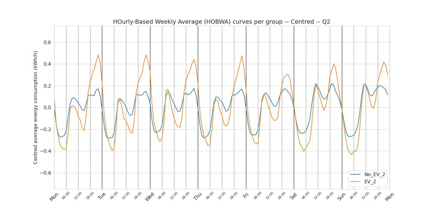
EV vs. no-EV : per quarter
First, we look at how the weekly consumption pattern changes with the season. For this we looked at the weekly pattern per quarter: Q1 contains the months of January February and March, Q2 contains the months of April May and June, etc… For making the blog post lighter, only the centred weekly patterns are reported under.
Q1

Q2
Q3
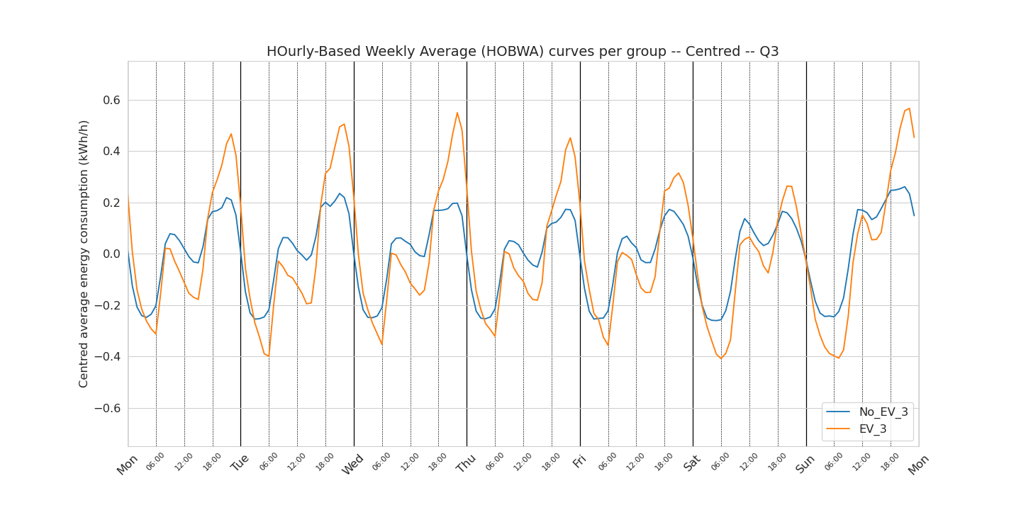
Q4
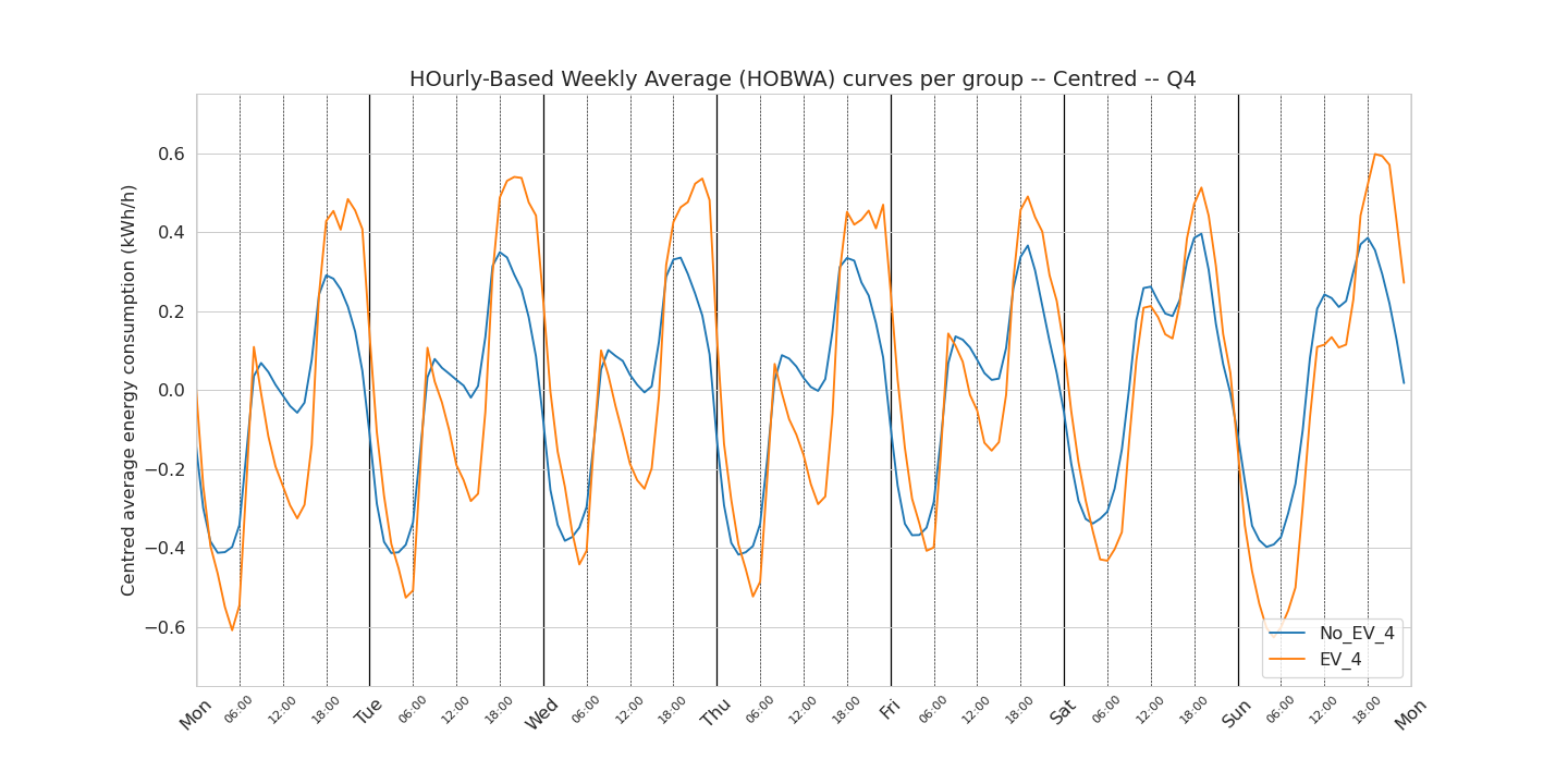
One observation I would like to focus on here is the Q1-Q4 (winter) curves of the EV owners. In these curves, we do not observe during the week days a delayed afternoon peak that we observed in the curve using the data from all the year. If we believe that this delayed afternoon peak is related to smart charging (which is a pure assumption), this observation could then show that during the winter, these smart charging devices do not help to shift the consumption during the night.
EV vs. no-EV : per housing type
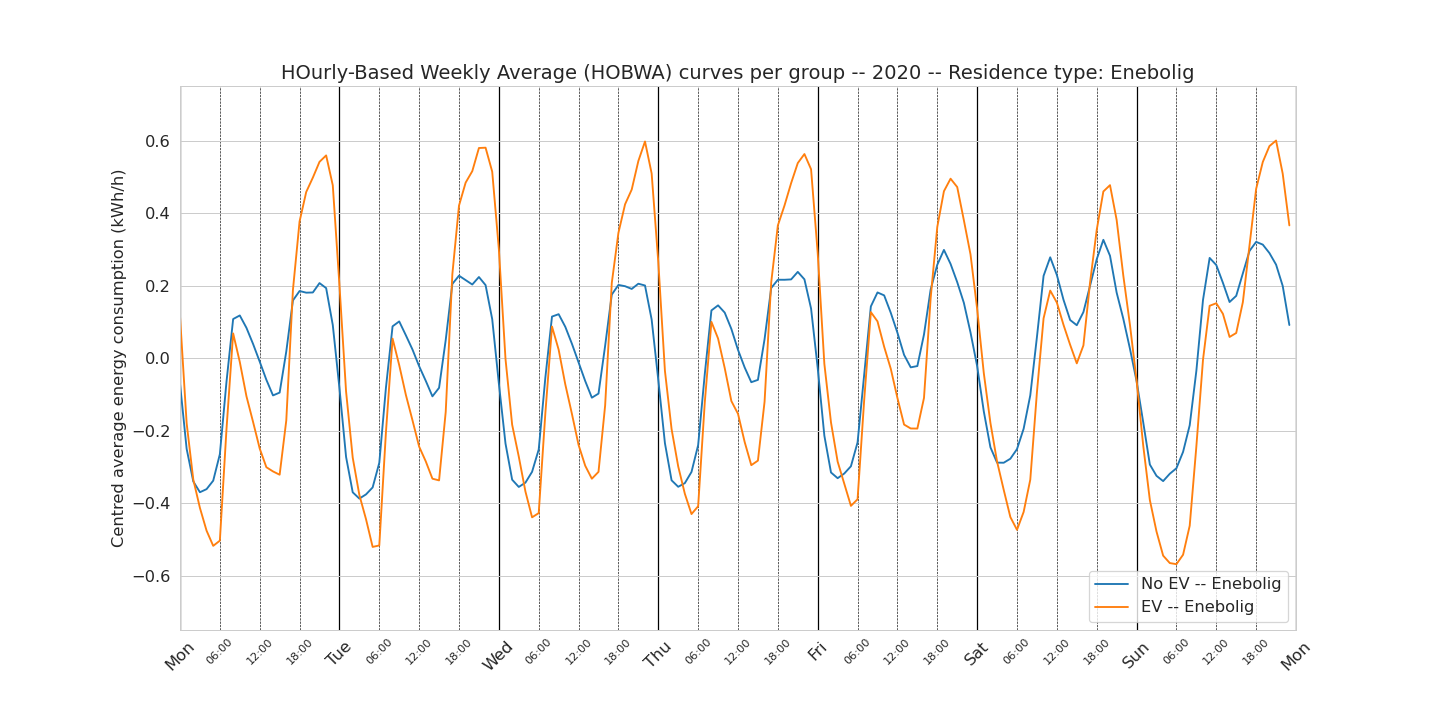
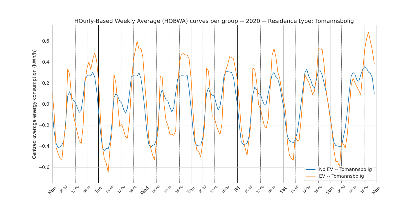
Second, we look at how the weekly consumption pattern changes with the housing type. This means that the number of end user per group is reduced. For example, there are only 17 end users in the EV group that lives in a town house. This lack of statistics, specially for the EV group, is reflected in the weekly patterns being more noisier.
Detached house (enebolig)
Semi-detached house (tomannsbolig)
Town house (rekkehus)

Apartment (leilighet)
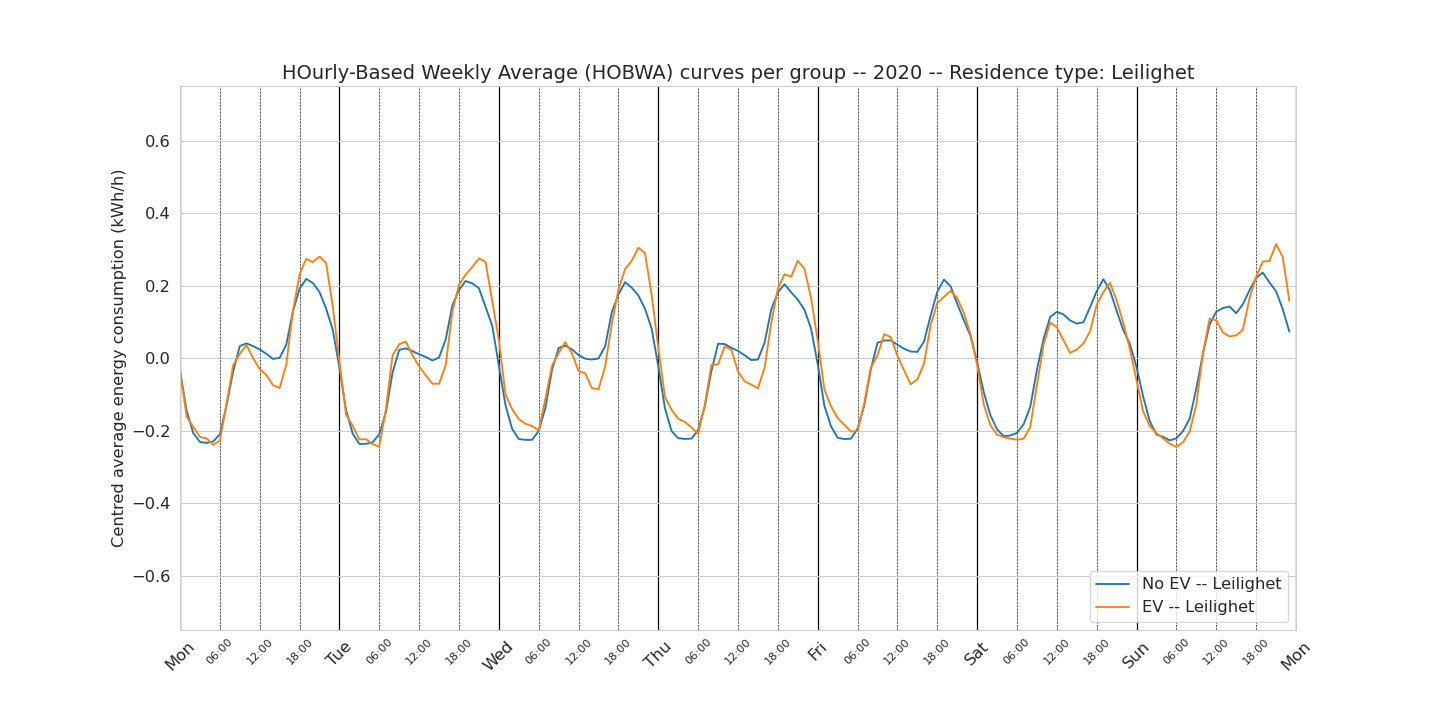
By looking at the weekly patterns per type of housing, we remove one of the possible factors explaining the variations observed on the whole group. Clearly we see that apartments are very similar, independently of owning an EV or not, because the EV is often connected to another smart meter than the one measuring the apartment consumption.
One surprising finding is that even once the type of housing similar, we still see a puzzling difference between morning and afternoon peak in both groups. Let us look at the centred detached house curve: in this graph, we observe a rather puzzling lower consumption from the EV group in the morning peak compared to the no-EV group. And this applies for all days of the week. There is no direct explanation of this observation.
Conclusion
There are many take home messages in this analysis. For example, we showed that EV owners have (in average):
- higher daily max than non EV owners
- higher afternoon peak during week days than non EV owners
- a (possible) shift of the afternoon peak towards later hours in summer but not in winter Don’t hesitate to contact me for further discussion on the topic.
Appendix
For the ones interested, we investigated if there is need to correct the hourly consumption data for seasonal variation when calculating the HOBWA patterns. In Norway, energy consumption is very correlated to exterior temperature and therefore seasonal. Our initial hypothesis was that the weekly pattern would be “more right” if using season-corrected consumption data as source (when of course not investigating the influence of the season on these patterns).
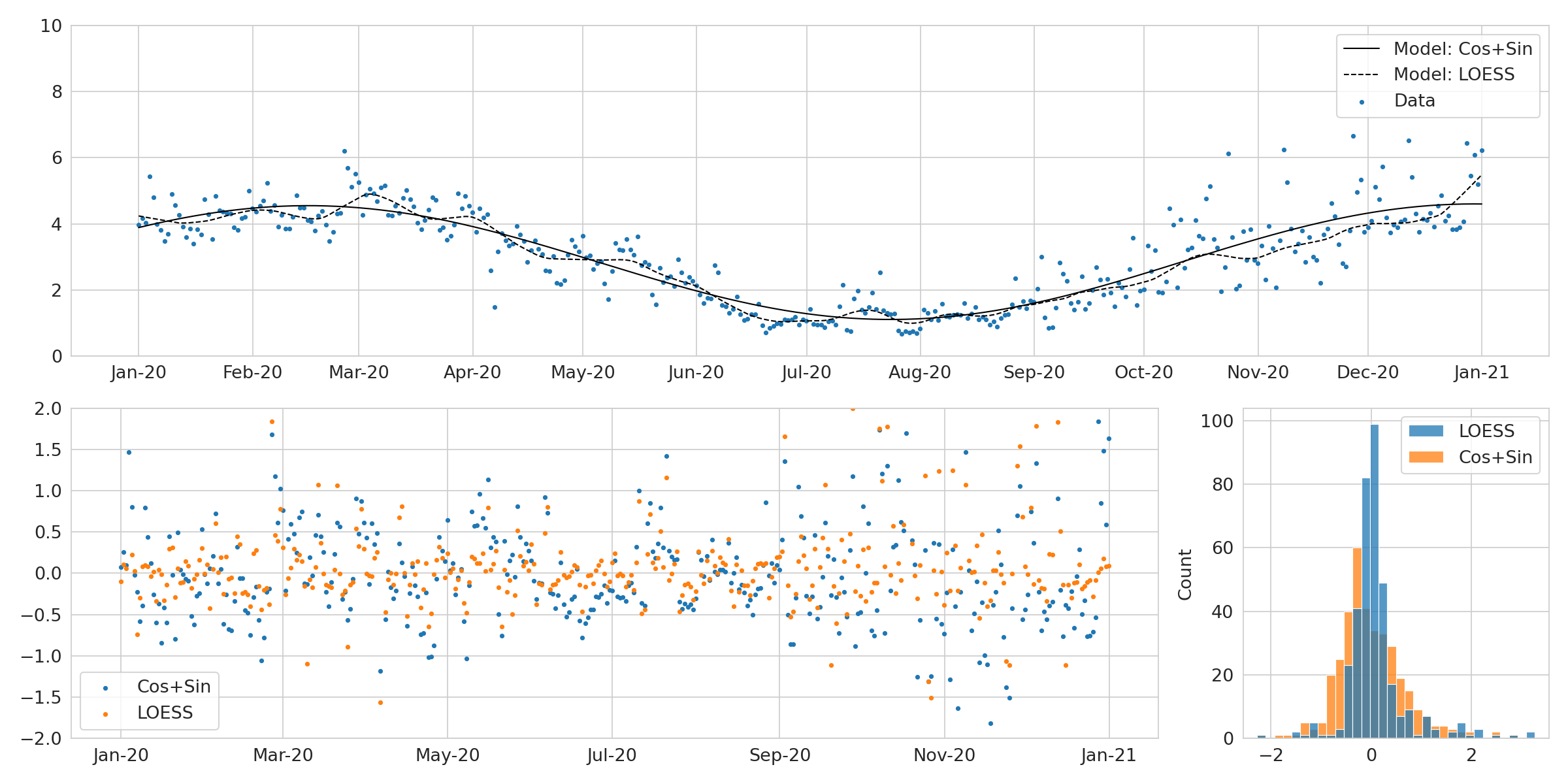
To test this hypothesis, we applied both cos+sin model and a season-trend decomposition using LOESS. We saw very little to no change in the weekly pattern when compared to the weekly pattern with non corrected consumption data.